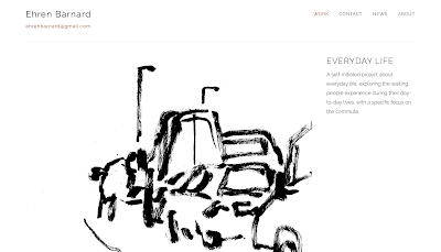
I wanted my website to be clean and simple, so that the work can speak for itself. It needed to be easy to navigate and use, with everything a client would need only a click away always. As soon as the website is opened all of my work is accessible; I believe having a welcome or home page would just be another thing for a client to click through to get to the work. The work is broken down into projects in a clear grid layout.
Having my email at the top of every page, under my name (with a 'home' hyperlink) means that it is always accessible, and they do not have to route around the pages to find it.
A quick succinct about page gives a little brief insight into my work and the motives behind it. My instagram link is on this page as well as the contact page, again meaning it is accessible without having to click through the whole website. A self portrait in the style of my work I thought was a nice little extra touch.
I have only included work I want to get commissioned for in the future. Each page has a short description of the project with a bit of background information to give it context. I am planning on writing a bit more on these sections to give a bit more detail about the projects.
Sketchbooks are a really important part of my practice and evidence the immediacy of my drawings. showing the more honest and 'rough' side to my work. This is important for authenticity, and to also show some more experimentation and looser image making abilities.


No comments:
Post a Comment