There is little unity between the elements and there is a lack of relation and interaction with the book and the functions it serves, depicted in the symbols. Also the book is not really represented as such, but instead is shown as a rectangle with the field notes brand in it. An audience would therefore perhaps not understand the piece as a whole or its meaning, the intention therefore getting lost.
So the task of today has been to try and find a way of tying all the loose ends together to create one coherent representation of me and my field notes books. I think keeping the brand of the book is at least important to me, because they are a specific thing and represent more to me than just a sketchbook. But I think by showing it as a book and by delineating it visually from the symbols helps to communicate what it actually is and what it stands for. Having a photocopied cover mixed with the line drawings creates a nice mixed media quality to the design.
These top two I wasn't particularly interested or excited by but the investigation continued.
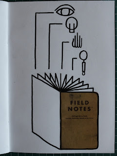
With this one I feel like I hit somewhat of a jackpot. I love the shape the image makes, the fanned out pages but also the relationship between the square on scanned cover and the angles of the drawn book. It also serves as a good base for a design compositionally allowing the symbols to rise out of the book, being grounded by it at the bottom.
However this is just too messy as an image. I hate the lack of clarity and order to the symbols, they just look unorganised and lazily thrown into the composition.
Introducing order to the composition has been really effective. It has quickly taken on a very diagrammatic feel, but there is enough of an interaction between the aspects. It communicates that all the separate symbols as functions are included and presented in the book and they all have a place in it.
I don't know if this works as the final or if I am totally happy with it, but it feels like I am getting somewhere.


No comments:
Post a Comment