Sunday, 14 May 2017

End of Module Evaluation

Although I can recognise and appreciate the value this module has on not only this course but also on my practice as a whole, I feel like I could have engaged with PPP a lot more than I have done. With it being one of the long modules which was always in the background of other, shorter modules, I can't help but feel like I have neglected it for a long time, forgetting to consciously consider it’s purpose and to actively keep up with blogging and feeding into it. I believe that this is also down to the more self-initiated style of the module; beyond the set study tasks I have not really included much else in it, despite almost definitely having relevant experiences and creating relevant work that would’ve suited this module perfectly. The other modules taking president has meant that I have tended not to engage with much extra curricular work outside of uni or the briefs set, dedicating most of my time to them instead. Something I want to change in second year is getting involved with a lot more outside of uni, and pushing that side of my practice as much as the brief led work. 
With that said, I do value the opportunity to reflect on my practice and although it is by no means coherent or clear in any way at the moment, I think considering what feeds into it, how it has changed and where it is going has proved very helpful in consolidating a more informed idea of what it currently is. I feel like it can be difficult to be conscious of what your practice is whilst making work and it is only when you step back and turn a mirror on it that you start to piece together the separate work you are creating into one united thing. 
This module has been useful even if just for bringing to light how unconscious I often am of what my practice is and how it then relates to the wider world of illustration. At this stage in my creative journey I am very much pushing what I am doing with blinkers on to where it fits or what application it would have in industry, but this is something I am hoping to gain more of an insight on next year. I am obviously aware of the contemporary work that I like and resonate with, but I could definitely be more actively engaged with illustration as a discipline and how it influences and shapes what I am making. 

Personal and Professional Practice is evidently a very reflective module and I am constantly reflective of what I am producing, but I think to push that one step further I should try and push the work beyond the course and try and respond to the outside world more, with more live briefs, developing a portfolio and creating more work that is available for people outside to engage with. This can be difficult when your practice is undefined, inconsistent or sporadic, but I do not deem this as a valid excuse not to get my work out there in this coming year, and I am thoroughly excited to do so.

Saturday, 13 May 2017

Creative Strategy Presentation

The Illustrated Self - Final Poster, Etching Trail and ERROR

So I decided that I did want to etch my final poster in the end, so I started and finished my plate of Thursday ready to etch Friday, as it would be the last day the print room was open until Monday's submission.

However the print did not come out as planned.


The detail just didn't come out at first, probably due to me wiping off too much ink when preparing the plate, or at least that is what I thought at the time...


However even when leaving more ink on, the details just weren't coming out, especially the little lines on the background which cannot even be seen on these prints at all. 


More experimenting with leaving more ink on, trying to find that perfect middle ground with would allow more detail but not just become murky like the print below.


I still cannot figure out which print is the most successful. I think this bottom one has merit in that it is dark and the details can mostly be seen however the ink does obscure other details which are important in the overall print. I love the antique feel that it has managed to inherit, but I still wish I could've found more of a balance of contrast.

Basically the problem is not etching deep enough. It is tricky to know when making the plate whether the marks made are going to come out or not, or whether they will hold enough ink. Evidently on this plate, they just weren't defined enough. 

I am going to re-etch another plate of the same design for the show, but this one definitely served as a lesson learnt in dry point; GO FOR IT! Don't be too soft with the plate basically. 

Wednesday, 10 May 2017

The Illustrated Self - Final Progress


Here is what can be considered the start of the final for my poster.

It still needs work and I still have things to do to go from where it's at to a finished piece.
I am unsure whether I am going to have time to etch this design, which was my original plan, and which will bring it to a more final stage, but time may not allow that to happen.

I am going to put some more detail into this drawing first and work into it to reach some kind of a finished point because I don't believe it works as effective as I would like as just lines.

I am also unsure of how to properly represent the field notes aspect of the book. At the moment it is no more than a book, it is not clearly a notebook or a sketchbook. I was originally wanting to use the scanned image to collage on top but with the light line weights this would look really out of place and wrong....I don't know.

Another hurdle.

The Illustrated Self - Solution

Today I reached somewhat of a solution the my poster problem. The work I did yesterday was still relevant in attempting to interact the separate elements together, however I couldn't help but still feel that some of my earlier roughs were very close are creating a unified and connected image, just not the one that I finalised.

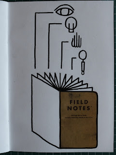
So resurrecting one of my older roughs, I combined it with my discoveries yesterday of the diagrammatic lines and ended up with a connected layout which was still reminiscent of old tarot cards and the feeling I was going for originally.


Keeping the ornate border links with my interests and aesthetic I was aiming for but the lines connect all the separate functions together and show their significance in the book. The actual book is also more representational and clearly communicated. 

Creative Strategy - A few slides

The duality of my image making approaches developed in first year; old and new; different ways of seeing and communicating.


The struggles of the first year.

Interest in life, based off experiences being sat on trains looking out over suburbs and other's lives fly by.


Creative Strategy - DUALITY

So for my presentation I am going to explore the theme of 'duality'.

This concept is one which came very apparent when I was word mapping about myself and applies to more than just my practice and the work I am making; duality impacts my character and most aspects of my life, which then in turn again inform my practice.

My presentation is going to be broken down into some categories with slides which relate, all hand drawn and attempting to visually display some representation of duality (or at least most of them will). The topics will relate to how duality works within my practice and my life and where I want to take my work next year.

All of the categories/slides are important in either illustrating my practice or my journey of the first year and will hopefully all flow together and link cohesively together. They are as follows:


  • Introduction to the idea of duality and what it means,
  • My character in relation to this concept and how it impacts that part of me,
  • First year, the journey my work has taken, the duality between the start and the end as well as the constant contrast between making work that pushes my practice and keeping a deadline/answering the brief,
  • Doing vs thinking, John Cleese and the struggles I have encountered in first year with unbalanced approach,
  • The solution, how sketchbooks have helped to make work that is meaningless to balance out answering briefs and making meaningful work,
  • Introduction to journalism interest, how the Ferry Bridge project was my favourite of this year and why,
  • Intro to interest in life as a narrative and journey, interest in looking into and learning about others lives, escapism, empathetic character trait,
  • Next year, research driven projects, writing, self-publishing, learning from others and telling their stories through work,
  • Extra curricular activities, zine fairs, collectives, leeds, events. 
There is the challenge of fitting everything into 8 minutes yet still including everything that is needed and relevant. I'm not sure if I have incorporated everything that is important or whether I have afforded enough time and energy on each separate bit. I need to practice the timing to determine this.

Tuesday, 9 May 2017

The Illustrated Self - Post Tutorial

Today's tutorial was super helpful in expressing my struggles with the course and the act of creativity but also in highlighting the development needed to improve and enhance the success of my poster. I think I reached a point with it where I just stopped developing and pushing the design with the deadline approaching and the little time left to get a whole A2 etching finished and printed, but as suggested by Matt, there were some flaws with the design.

There is little unity between the elements and there is a lack of relation and interaction with the book and the functions it serves, depicted in the symbols. Also the book is not really represented as such, but instead is shown as a rectangle with the field notes brand in it. An audience would therefore perhaps not understand the piece as a whole or its meaning, the intention therefore getting lost.


So the task of today has been to try and find a way of tying all the loose ends together to create one coherent representation of me and my field notes books. I think keeping the brand of the book is at least important to me, because they are a specific thing and represent more to me than just a sketchbook. But I think by showing it as a book and by delineating it visually from the symbols helps to communicate what it actually is and what it stands for. Having a photocopied cover mixed with the line drawings creates a nice mixed media quality to the design. 

These top two I wasn't particularly interested or excited by but the investigation continued.


With this one I feel like I hit somewhat of a jackpot. I love the shape the image makes, the fanned out pages but also the relationship between the square on scanned cover and the angles of the drawn book. It also serves as a good base for a design compositionally allowing the symbols to rise out of the book, being grounded by it at the bottom.


However this is just too messy as an image. I hate the lack of clarity and order to the symbols, they just look unorganised and lazily thrown into the composition.


Introducing order to the composition has been really effective. It has quickly taken on a very diagrammatic feel, but there is enough of an interaction between the aspects. It communicates that all the separate symbols as functions are included and presented in the book and they all have a place in it. 

I don't know if this works as the final or if I am totally happy with it, but it feels like I am getting somewhere. 

The Illustrated Self - Further Development


Further explorations of the function of the field notes book.

I really like what these symbols have become, from the figurative representations to literally just a few lines each. Especially the hand; I love how simple yet clear it is, still looking like a hand but in a very stylised and reduced form.

I am really interested in the layered roughs, and think these could work really nicely with layered print techniques. The bottom right was a more finalised rough idea; looking back I am now unsure why I chose that one to develop as I think some of the others are a lot more successful. It lacks unity and a clear link between all the elements (something which came up rightly so in my tutorial).

The secret society vibe has been carried through with these roughs also, especially when the symbols are placed inside circles. I wrongfully thought I had reached an end point though and now I realise there is more to develop with these. 


Creativity - John Cleese, GENIUS

Thank you Matt for the recommendation; absolute lightbulb moment.


Watching this video was invaluable, inspiring, insightful and so helpful in understanding more about the mystery of creativity and the generation of ideas or solutions to problems. It also further highlighted to me the mistakes I have been making all along in my creative journey and how to improve the struggle of making work and having ideas.


  • Space and quiet time is necessary and paramount in creating work. Stressing or getting anxious or 'closing' yourself off when nothing comes to mind is the most crippling response.
  • Playing is the way to be creative and to create more exciting and adventurous work, EVEN when dealing with serious subject matter or concepts.
  • Humour is another catalyst which enhances and fuels play.
  • Sitting around on a problem is OKAY. Return to the problem at hand as you do to the breathe in meditation and something will come in the end, hopefully. In the meantime draw and play and think all the while returning to the problem. 
  • Don't get distracted by other things that need doing or the internet or even reading. Set aside enough time away from everything to allow the ideas to come and the play to happen.
  • Anxiety about not solving the problem is totally normal, just ride it out and wait for what is to come on the other side. 
I am going to think more about what John says in this lecture and try and slowly implement it into my work and see where it takes me. I am really hoping and feeling like this will alleviate a lot of the blocks I have been coming into contact with.

Friday, 5 May 2017

Land Boys - Symbols, Inspiration, Love

I really really really love the work of Caleb Owen Everitt and Ryan Rhodes, making up the design, art, illustration, branding company Land Boys.

Their slightly crude, very simplified drawings and visual work blends an old classic aesthetic with ancient hieroglyphic hints and cave art tendencies but with quite a contemporary or timeless feel; Self described as transcending 'a style or time with regard to the art of communication.


They are not illustration per se, but just the way they simplify the images that they are making, often reducing them down to just simply outlines create a very symbolist feel to their drawings, creating symbols as much as figurative images. I'm really drawn to this quality in their work, the fact that they use such basic drawing techniques which seems to suggest more of a narrative in the work, or at least a meaning that is to be derived from the symbols.


It is also that vintage yet simultaneously timeless feel that appeals to me greatly. They are able to capture the essence of old design works and ancient art forms that feel right at home in a modern setting, whether that is on a t-shirt of a popular contemporary clothing company or in a restaurant. 

Some of their work reminds me of vintage zippo lighter engravings, or something of a similar vain. They are meaningful in a simple way, the images representing something but in a restricted form. 


Their artistic products are beautiful and look as if they have been dug up or found from 100 years ago. I would say that these pieces are not illustration, with no real purpose or function for being on the objects they are created for.


Wednesday, 3 May 2017

The Illustrated Self - Field Notes, Development

In the group crit it was suggested that the field notes design needed something else to it, some more context and visual information. Matt suggested to try and include some visualisation of what the book does for me, what it means and what purpose it serves my practice and my life around the centred image of the actual book.

What does it serve?

  • observation
  • documentation
  • tangibility
  • reflection
  • creativity 
  • organisation
  • understanding 
  • questioning
  • curiosity
  • advice
  • guidance
It was a real challenge to try and illustrate these concepts without being too obvious or stereotypical, and this is something I am still going to explore further.


I am really into the slightly dark, vintage feel these roughs have to them, especially the ornate borders. They remind me of old tarot cards or symbolistic art forms such as memento mori. These are things that i have tried to incorporate into my work for a while because it's an aesthetic that I love and it's ability to imbue meaning into objects in really fascinating. 

I am unsure whether some of the images are too obvious, such as an eye for observation and a hand for tangibility, but I almost feel like that simplicity is one of the successes. It's a valuable task to them try and distill these symbols into even simpler forms also, such as on the right page, telling a whole concept and function in a few lines and shapes.

The Illustrated Self - Initial Roughs, Field Notes


Another etching idea.

My Field Note books are very important to me. Acting as journal, sketchbook, to do lists, shopping lists, diary, everything and anything that warrants writing down will probably find it's way into these little books and they go everywhere with me. In short, they basically represent my life and me for the period of my life from when I start one to finishing it. 

I wanted to have an ambiguous poster of myself and this adheres to that. A beautifully rendered etching of my field note book is an illustration of me, but it has a story and a concept and an idea behind it which I really like. It is more of a representation and a symbol of my life, reflecting the observant, reflective, creative, obsessive sides to my character.


The Illustrated Self - Initial Roughs, Train Window


This one was influenced by a personal experience that I had a while ago when sat on the train and looking out of the window at all the suburbs and lives flashing past beneath me. There was something almost comforting about looking in on these lives from the outside, more satisfying than actually living those lives, but being a quiet observer, unobtrusive. 

This reflects my interest in life but also my hopes for next year and my practice in the future. I want to present people's lives, real stories and capture that feeling of looking in quietly on lives other than our own. There is something very Hopper-esque about this idea.

This would be etched.

I feel like this idea may work better in my presentation though, as a introduction and inspiration for a proposal for next year. 

The Illustrated Self - Initial Roughs, Bridges

'Cross that bridge when you come to it' is something I constantly find myself saying to other people, and is something which I do subscribe to, but still can end up worrying about the future for no reason. It is a lesson which I wish I would adopt more often in life as well as in work, and is one that also sums up me as a person and the duality of my character.


With my reflections on my interest in life, I tried to distill the narrative of life and the journey and experiences we have into some simple visual symbols. Bridges was one of those ideas.

I am very keen to explore layering in print, thinking to have the bridges etched in intricate detail and then have some looser images underneath, either lettering or actual drawings. This would incorporate the idea of duality too. The different bridge style are also representative of different people's lives and journeys.