Cody Hudson for Atlas
I find skateboard decks a very interesting and unique platform for applying illustration and art. No other canvas is of a similar shape, narrow and tall, nor are many others as ephemeral and inherently temporary; they are made to be destroyed, used and worn, the graphics only realistically having a lifespan of under a month in most cases. Yet despite this, a lot of thought and energy and creativity goes into their creation, even when most decks, excluding their own unique shapes, are not wildly differing. The role these illustrations serve then is a simple one, to decorate the decks but not necessarily to make money; most are all priced similarly regardless of graphics. Instead they act as works of art themselves, something to own and use and to be aesthetically appealing. They often influence which decks one buys, relating to the skateboarder's identity, what their tastes are, what work they are into and also the identity of the brand and the creator. The majority of skate companies that put out the most interesting and illustrative work are owned by skateboarders who themselves are also creative people, artists, photographers, illustrators and designers with a passion for good work and what they put on their products is a reflection of that. However the context of a skateboard deck doesn't really influence the actual illustration a lot of the time. There is no article to respond to or meaning to portray. Obviously they are responding to the culture and the ideologies behind it, and at times will have a message or specific purpose behind the work, but mostly they are aesthetically pleasing, creative and artistically freeing projects.
This typology vase collection by Cody Hudson is very charming. The actual drawings are very loose and energetic, simple in medium consisting of one monotonous weight of line, but built up into patterns and textures. The density of the layout creates an appealing density to the overall board, along with the black lines on white. It portrays the company as creative and likely independent and relatively small scale, working with artists to what could have been a very loose or non specific brief; they may have just let Hudson create what he wanted. Atlas is also portrayed as organic and human with the loose nature of the drawings.
T-Shirt by Unga
As a product, the t-shirt is probably one of the go-to items used to apply illustration. They are universal, very cheap and easy to make, and widely accessible and visible. I believe that they are perhaps more accessible than prints, as it gives a consumer another reason to buy the work, as they can use it and wear it; it is a less guilty purchase than a print and instead of having to frame or display the work you bought, you become the platform with which it exists. The t-shirt also relates very strongly again to the identity of the consumer, acting as an outward expression of taste and style, which a lot of people commonly invest a lot of energy and thought into. A t-shirt such as this is mainly aimed at fans of Unga's work, but more so than a print, it also appeals to a wider audience of people who are perhaps not art enthusiasts, but who wear t-shirts and can appreciate it for that quality. I feel like at times a t-shirt can be a statement, especially one with a naked larger man smoking a cigarette on it; where as a print in your house would only been seen by a select few who are welcome, a t-shirt is seen by anyone and everyone you encounter whenever you wear it. Also, it seems as though a print on the walls in your house would have to be somewhat more toned down and less bold than the kind of image that would work on and be appropriate for a t-shirt.

Wooden Man by Rob Hodgson
A lot of Rob's work is applied, whether that is too kids bomber jackets or a packet of novelty pencils. This wooden man character appears to be an entirely self-initiated product, an item that he has hand crafted and finished and painted, as an ornament, maybe even a toy, or just a piece of art for someone to own. It serves no other purpose than to be a physical manifestation of his creativity and work, another canvas in which to adorn his playful illustrations onto. By limiting them to 20 it makes them a more personal and unique item, especially as they are each hand made by the artist himself. They have an added value as a result and an appeal to not only fans of his work, but also those who appreciate crafted yet fun and inoffensive items. You can picture it being sold in a little bookshop or novelty craft and gift shop, and not matter how bad that sounds it isn't playing down the work in any way; I'm not taking about cheap or mass produced gifts, I mean artistic, creative and quality gifts and crafted items.
I really love the simplicity of this piece and the tangible appeal of having a piece of work that can be held and displayed away from a print. It is a very basic premise, but well executed and very appealing. The packaging is also important, the inclusion of leaves in the box, the little information label, the illustration on the box; all these elements add up to create a really simple yet beautiful and charming finished product.
Kraken Spiced Rum by Stranger&Stranger
I have always loved the Kraken label from working in a bar when I was back at home. The octopus illustration is quite beautiful, the antique feel of the image, with tone built up using a series of lines as if it was a woodcut, the intricate detail of the little ship wrapped in the tentacles and the light line weight forming a delicately detailed drawing. As a label, it needs to reflect the drink's identity, whilst playing into the identity of the target audience, and also the brand image and quality. Rum has a historical nautical/pirate vibe, hence the octopus imagery and the antique style of image making, which works really effectively; it is not a cliched image in my opinion, it doesn't fall into a seemingly easy trap of being stereotypical and cheap when playing on the pirate theme. Instead it looks classy and quite ornate, I can picture it on a table in an old ship in the 17th century. I think this is because Stranger&Stranger have avoided visual motifs that are too overplayed or expected, and focussed more on the name of the drink, which already has similar connotations, creating what is a well crafted image on it's own. The use of just that one illustration also adds to this effect, instead of overloading the space with obvious motifs but keeping it simple and powerful.

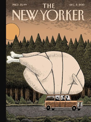
The New Yorker Magazine by Tom Gauld
The purpose of magazine covers is mainly to draw people into buying and reading the magazine, to stand out on a shelf of other magazines, to attract a certain audience whilst portraying the ethos of the magazine and an over view of it's contents. The New Yorker is known for its illustrative and visually attractive covers and as a result will attract an audience who appreciates artistic and creative disciplines. This particular issue is for Thanks Giving, and the concept Tom Gauld is displaying is a simple yet very effective one. By using the recognisable motif of the whole turkey along with the pine trees in the background, the theme of the issue is instantly quite clear without being too obvious. The humour of the oversized bird tied to the roof of a little family car adds a playful and charming element to the piece, as well as the relatable narrative of driving to visit family on Thanks Giving. This narrative twist also adds to the effectiveness, as there is a story present but in a subtle way. The style of drawing and earthy, muted colour palette creates an inoffensive and appealing cover for a wide audience and it is by no means unskilled; the tones built up using a variety of mark making creates a very textured image, but one that is equally as soft and almost innocent. The cartooned depictions also plays into this idea.


